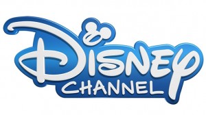
So over the years we have seen many logos come and go from our favorite family network. Who could forget that Mouse / Television style logo when it all began. There still was something magical about it.
No matter the logo, Disney Channel has always managed to keep itself fresh and re-brand the look of the station often to fit current trends. The latest logo that has been in existence for quite some time. Apparently the Vice President of Marketing and Creative at the channel mentioned that the current logo was created at the start of Widescreen Televisions, and HD becoming more the norm. So it was intended to fit within the formats and be that little bug in the corner. It is a big logo in my opinion, king of large and never really was hidden. But now a new era of the channel is debuting.
We have seen the end of many of our favorite shows and now coming up, the launch of new ones we cannot wait for like Girl Meets World. So to fit into a new feel of what is hip, now and fun, the new logo will make it’s grand debut.
As a designer it is a nice simple logo, focusing on Walt’s signature Disney look with a tiny Mickey (very DisneyQuest in style) over the “I”.
A big concern was also keeping that it could be used with the wand in show sweeps and buffers. These often focus on a Disney Channel star drawing the logo. This was a priority since many shows are still be shown in other countries and those stars for shows no longer shooting would needed to be used.
In the end, the look is clean and fun and still, to me says Disney.
Thoughts?

